Why Designers Will Love Facebook New Page Design?

Facebook is testing a new page design for pages. The main changes include, resizing the profile picture to be smaller, bigger cover photo, and a new placement to the CTA button.
We believe that the new design is such a great one for designers, because it gives better space in the cover area to add more details and styles. Also, pushing the profile picture and page name to the very left side is good, as it empowers designers more and solve the past’s obstacles.
Cover Best Dimensions: 1200 x 444
How the new page design changes the logo strategy on social media?
The new update puts an end to brands/businesses who tend to use promotions in the profile picture or place the full logo + wordmark.
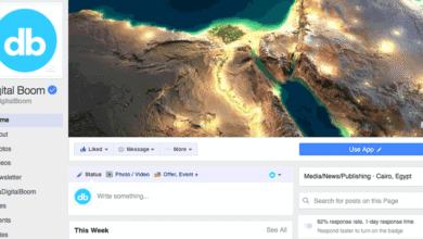
We believe that the profile picture on Facebook should contain your logo without your wordmark. Why? For a simple reason, how many people tend to visit your page directly versus how many people tend to visit your page from newsfeed’s posts? Answer this question and we’re pretty sure that you will change your logo placement strategy on social media not only Facebook.screenshot of digital boom new page design
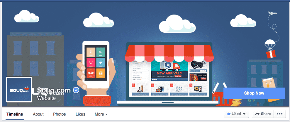
Sample regional pages who should update their cover photos immediately if this proposed design is approved:
We’ve picked few regional pages who should update their cover photos as soon as possible to fix the bug caused by the new page design.
Have anything to add to this story? Please drop us a line in the comment box below.


