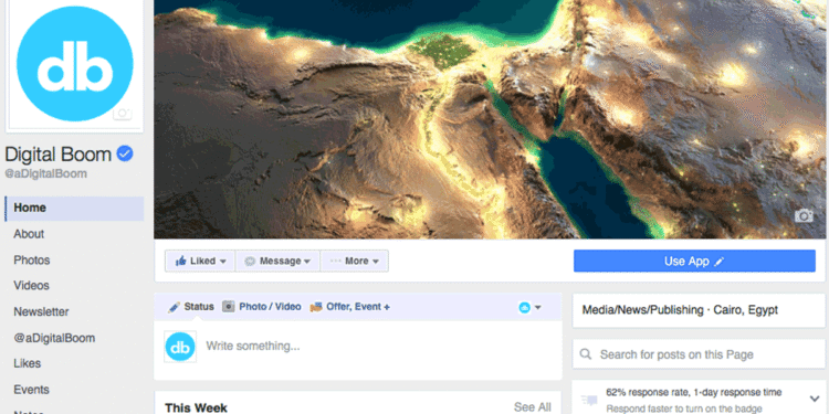
Facebook is testing a new layout design for pages, which adds three columns to pages layout, aiming to make information more accessible and organized for visiting-users.
Here’s a list of the major changes to the new layout design for pages:
- Left Column: a new sticky-sidebar includes the profile picture, so whenever you scroll down, you will be able to see your page logo, name, shortcuts to about, videos, tabs and other details (see screenshot).
- Middle Column: includes cover image, week insights, then timeline posts. The cover image is now standing-alone big-image, without any overlay details likes profile picture or even the page name.
- Right Column: this new sidebar includes the “about” box, page videos, custom tabs icons, current events, this sidebar isn’t sticky but smart scrolling.
- Ad-free: no more Facebook ads on the right column, so you won’t see ads from competitors or any other brands/entity showing to your visiting customers.
- Page call to action has been moved to the right-hand side under the cover image and above the page category label.
Check out the full layout design in action
Screenshot ScreenshotIt’s not the first time that Facebook tests a new layout for pages, few months there was another proposed layout but seems like it didn’t pass the test.
Let us know your thoughts about this new design/layout in the comment box below, or join the conversation on facebook/twitter @adigitalboom


