Google Updates Its Iconic ‘G’ Logo for the First Time in Nearly a Decade
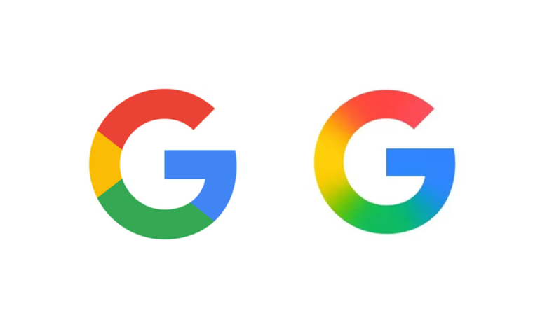
Google has quietly changed its icon for the first time in nearly a decade, updating the standalone “G” logo with a smoother gradient finish. The redesign reflects Google’s broader shift toward AI and human-centered design.
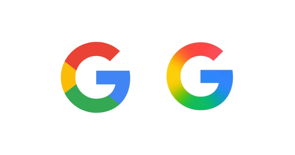
The new Google “G” icon blends red, yellow, green, and blue hues in a fluid gradient, replacing the hard-segmented design introduced in 2015. It is already live on iOS and select Pixel devices, with a full rollout coming to Android and web platforms soon.
Visual evolution amid AI expansion
Google’s new icon design aligns with its expanding AI-first strategy, as seen in the Gemini assistant and other generative tools. The softer gradient mirrors this transformation, offering a more adaptive and approachable feel across apps, extensions, and smart interfaces.
Importantly, this change affects only the “G” icon—not the full Google wordmark.
Quiet update, loud implications
While the update may seem subtle, it speaks volumes in branding terms. Google is embracing a visual language that prioritizes fluidity, warmth, and flexibility—traits central to AI-powered user experiences.
The new G icon also improves visual performance across modern device screens, from smartwatches to automotive displays.
Analysis: A logo tuned for the AI age
By updating the “G” logo, Google signals its evolving identity in the AI era. The soft gradients build emotional trust, subtly guiding users through a landscape increasingly shaped by machine learning and automation.
Google hasn’t made a loud announcement, but the message is clear: this isn’t just a logo change—it’s a visual cue for the company’s next chapter.

