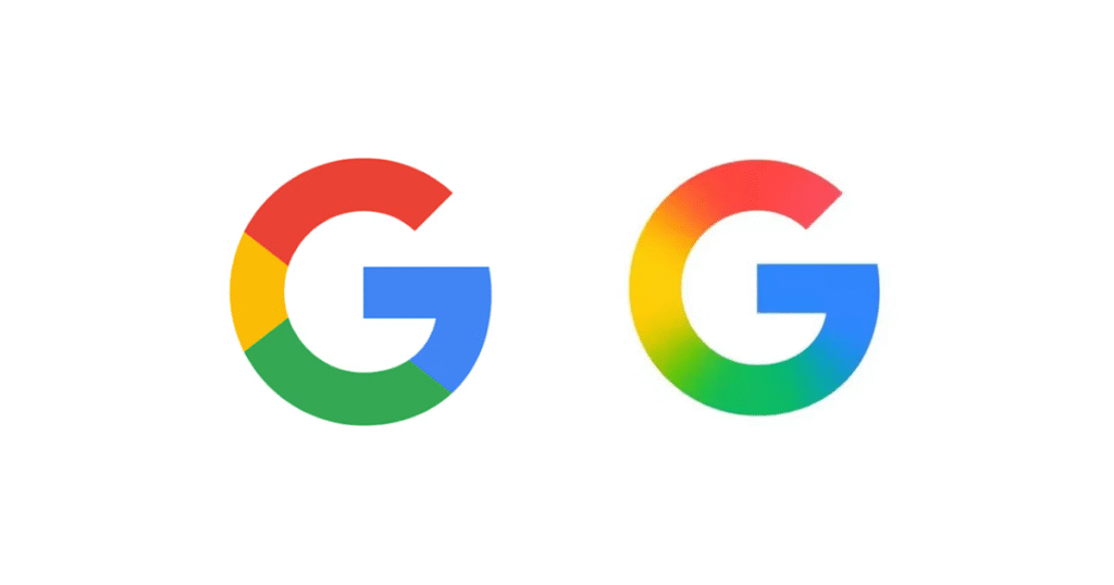
The new design is already visible on Google’s app icon for iOS and some Pixel devices. It will gradually roll out across other platforms, including Android and web-based services, in the coming weeks.
The update comes as part of Google’s broader visual overhaul tied to its growing investment in artificial intelligence products, particularly its Gemini assistant, which debuted earlier this year with a similarly fluid gradient identity.
A Google spokesperson did not announce the change formally but confirmed that the redesign aims to “better reflect the adaptive, helpful, and human-centered experience users now expect from Google.”

Visual evolution amid AI expansion
The “G” logo is one of the most recognizable brand icons globally, often used in standalone contexts such as mobile apps, Chrome extensions, and smart home interfaces. The new gradient design signals a shift in tone from bold and segmented to soft and blended—mirroring Google’s repositioning as an AI-first company.
The full Google wordmark remains unchanged.
Quiet update, loud implications
The change may seem minor, but for brand strategists and interface designers, it represents a significant direction shift. Google’s visual updates in recent months have increasingly leaned into gradients and softer design language—an aesthetic now seen in Gemini, Bard, and other emerging platforms under Alphabet’s umbrella.
The gradient style also enhances adaptability across devices and screen types, a key consideration as users interact with Google across everything from wearables to cars.
Analysis: A logo tuned for the AI age
The redesigned “G” isn’t just a cosmetic tweak—it’s a brand signal. It reflects a larger narrative shift at Google, one where AI isn’t just a product layer, but the company’s central identity. In that light, the softened edges and color blending are doing more than following trends—they’re building visual trust in a fast-moving tech landscape.
Consumers may not consciously notice the change, but they’re already engaging with the ideas behind it. Gemini’s launch, Search Generative Experience, and the growing presence of AI in Gmail and Maps all point to a new Google—one that wants to look as dynamic as the technology it builds.
This logo change quietly reinforces that story. Subtle, intentional, and aligned—it’s the kind of brand work that most users will miss, but all of them will feel.


