The evolution of the Twitter brand
Research: 90% of internet users recognize the Twitter logo.
What is a logo? Why do companies put in the effort to redesign, refresh, and update their logo? By definition, a logo is a symbol adopted by an organization to identify its products or services. Ultimately, the logo is the company, and the company is the logo.
As the year draws to a close, we marked the occasion by looking back at how our logo, or the Twitter bird, has evolved alongside our brand. What first started as our CEO, Jack Dorsey’s idea of an SMS-based communications platform, Twitter has now evolved to a company with a clear purpose: it helps people stay informed about what’s happening globally and what people are talking about right now.
From breaking news and entertainment to sports, politics, and everyday interests, that is what makes Twitter unique. It means different things to different people regarding how much they may or may not Tweet, but for being informed about all the world’s happenings as they unfold publicly.
In 2016, on our tenth anniversary, we commissioned a study to gain a deeper understanding of our brand legacy from people worldwide and found that 90% of internet users globally recognize the Twitter brand. Our purpose was clearly recognized, understood, and appreciated by users the world over, and for non-users, the brand was almost unanimously recognized.
This, of course, starts and ends with our logo.
First logo launch: 2006
Our original logo spelled out the company name ‘Twitter’ in blue to convey simplicity.
 The bird iterations: 2006 – 2009
The second logo in 2006 saw the debut of the bird icon. A year later, we introduced an update to the bird, now facing right, drawn by our co-founder, Biz Stone. This logo evolved in 2009 to make the bird more friendly.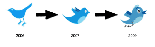
The removal of features: 2010
The next step in 2010 saw the introduction of the silhouette design. The bird’s shape was now streamlined; its features and legs were removed, and the beak was made to be less curved, resulting in a solid blue minimalistic logo.
The most recent logo update: 2012

Finally, in 2012, we introduced the latest change to the Twitter bird, which is now crafted purely from three sets of overlapping circles, similar to how our audience’s networks, interests, and ideas connect and intersect with their followers. We removed the tuft on the head, reshaped the wing, and moved the beak upwards.
Now the bird signifies the brand all by itself, and there’s no longer a need for text, bubbled typefaces, or a lowercase ‘t’ to represent Twitter. Basically, the Twitter bird is both a symbol of what we are and a metaphor for its permits. It is the ultimate representation of freedom and wide-open possibility, and of course, it can tweet.
As our Chief Marketing Officer, Leslie Brand, once put it, “The way I like to think about it is, you now see the bird as a window into what’s happening in the world.” It’s been an exciting journey, and we’re extremely proud to represent a brand that’s become universally recognized in just over a decade. After all, the bird is Twitter, and Twitter is the bird.
To download the latest Twitter logo, please visit brand.twitter.com.