From Bird to X: The Evolution of the Twitter Logo (2006–2025)
Recognized by 90% of internet users, Twitter’s iconic bird logo once symbolized global conversation. But by 2025, the platform—now rebranded as “X”—has taken a bold turn away from its roots.
Why Logo Changes Matter
A logo reflects more than just aesthetics. It defines how a brand wants to be perceived. For Twitter, each redesign marked a shift in strategy, identity, and purpose—from social messaging to real-time news, and now to Elon Musk’s vision for an “everything app.”
Global Recognition, Built on the Bird
In 2016, Twitter commissioned global research that found 90% of internet users recognized the bird logo. It had become one of the most iconic digital symbols of the 21st century, even among non-users.
2006: The Original Twitter Logo
The first logo simply spelled out “Twitter” in blue lowercase letters—clean, web-friendly, and simple.

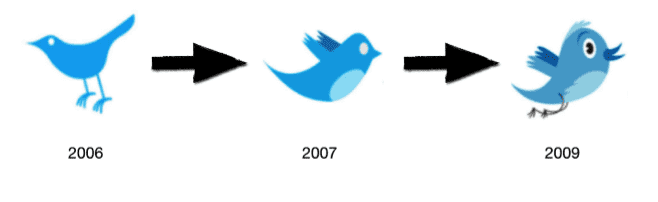
2006–2009: Birth of the Bird
The bird first appeared in 2006, with updates by 2009 that made it friendlier and more recognizable. Biz Stone, Twitter’s co-founder, designed the early bird that faced right and captured the brand’s playful spirit.
2010: Silhouetted Simplicity
Twitter adopted a sleeker silhouette in 2010. The legs were removed, the beak was simplified, and the bird took on a bold, solid blue look—representing a more mature, mainstream platform.

2012: The Iconic Twitter Bird

This version, made entirely of overlapping circles, became the definitive Twitter logo. No more text or lowercase “t”—the bird could now stand alone. It represented connection, movement, and freedom. By then, the bird was the brand.
2022–2023: Elon Musk and the Twitter Reboot
In October 2022, Elon Musk acquired Twitter and immediately began reshaping it. The company’s vision, culture, and features went through aggressive changes—most notably, the introduction of paid verification, Twitter Blue, and a pivot toward “X,” a platform Musk described as an “everything app” for payments, content, and social interaction.
These changes set the stage for a radical rebrand.
2023: Goodbye Bird, Hello X
In mid-2023, Twitter officially dropped the bird. The logo was replaced with a minimalist black-and-white “X” that reflected Musk’s ambition to rebuild Twitter under the broader X Corp. brand. The domain shifted from twitter.com to x.com, and the platform’s visual identity pivoted to match a futuristic, bold, and enterprise-centric direction.
This marked the end of the blue bird era. The cheerful, expressive symbol that once embodied light conversation and breaking news was replaced with a stark, geometric mark—more akin to a fintech or infrastructure startup than a social media app.
2024–2025: The X Era
By 2025, the X brand continues to evolve. Its new logo is consistent across all X products—payments, AI, livestreaming, and more. The design remains minimal, with a black-on-white (and dark mode inverse) aesthetic. Despite initial backlash, the X identity is now widely recognized in global markets, particularly in fintech and AI circles.
For longtime users, the bird may be gone—but its legacy lives on in the memory of one of the internet’s most recognizable logos. From playful tweets to powerful transformation, the logo has mirrored the journey of a platform that reshaped how the world communicates.
Download X brand assets at x.com/brand.