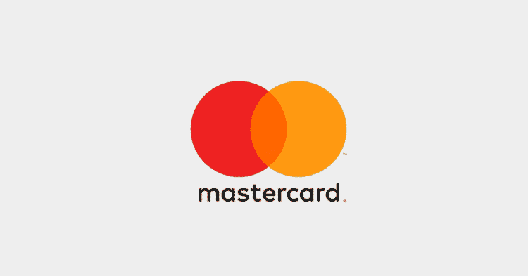
mastercard has released a new flat logo design to work smoothly across all digital platforms, retail stores and devices. the iconic red and yellow interlocking circles remained the same, the word-mark got a new placement under the logo or on the right, to be more clean and digitally flawless.
MasterCard haven’t done much changes to their logo since 1968 – they only changed their name once from “Master Charge” to “MasterCard” in 1979. In 1990, they started using the Italic font MasterCard, they haven’t changed the core of their logo though (the red and yellow circles).
The redesign was done by Michael Beirut and Luke Hayman of Pentagram, one of the industry’s most respected design firms – the project is focusing on simplicity, connectivity and seamlessness
“Evolution of the brand identity to emphasize simplicity, connectivity and seamlessness.”
And it looks even better on dark backgrounds
mastercard Typography
They used a font called FF Mark, the font is fully lowercase (I’m sure you noticed by now why we’re writing mastercard in lowercase – not MasterCard)
Masterpass
The change didn’t just include their logo, mastercard is expanding its Masterpass digital payment system, partnering with numerous banks and retailers to give consumers the ability to use the service for in-store purchases. The enhanced service will be rolled out over the next few weeks. Garry Lyons, chief innovation officer at MasterCard, said the improvements to Masterpass will change the face of digital payments.


